Beautiful brand development for Landhaven
Andrew Minto is the face behind Landhaven Developments, a property development company with a difference. Andrew’s belief in taking his time, doing an exceptional job and building homes for the future feels refreshing and gently radical. We worked together to subtly refine and develop his brand, ready to design and build a new website.
Landhaven had branding in place and a website that Andrew had built himself. Aware of the limitations of a DIY website, Andrew was ready to invest in a website that reflected the quality of his work and added a little of his signature “wow” factor.
He was frustrated with the time the website took up and knew that it didn’t showcase his exceptional work to its fullest potential. In short, it could be putting off clients. He was also beginning to doubt Landhaven’s brand identity – worrying that it wasn’t conveying the right message. Along with this, there was a new arm to the business, “Co-Haven” which develops property for professionals who are co-habiting.
Andrew approached Anorak Cat Websites to design and build a new website. However, after initial conversations with Anorak Cat Director Amy, it became clear that Andrew needed more guidance and a deeper understanding of how his brand needed to function.
Ellie was introduced to us as part of Landhaven’s website redesign process; on the basis that you need to know who you are and what you’re saying – before you build a website.
Andrew Minto, Landhaven Developments
As a long-term collaborator with Anorak Cat, Amy introduced me to Andrew so that we could review his branding. Having been burnt by designers before, Andrew was nervous about the process and worried I might suggest a total rebrand. Instinctively, I knew this was unlikely and I could see there was lots of potential in the brand.
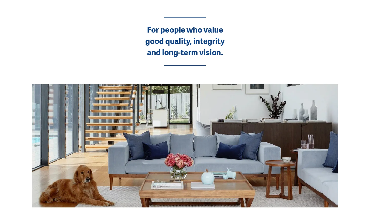
I proposed working through my brand strategy process, giving us a chance to understand what the business was now and where it was aiming for. The process of defining the strategic vision, considering who their clients are and understanding how the brand needs to feel. Once that was defined, we had the tools to objectively evaluate the brand identity and identify where we needed to shift parts of it in new directions.
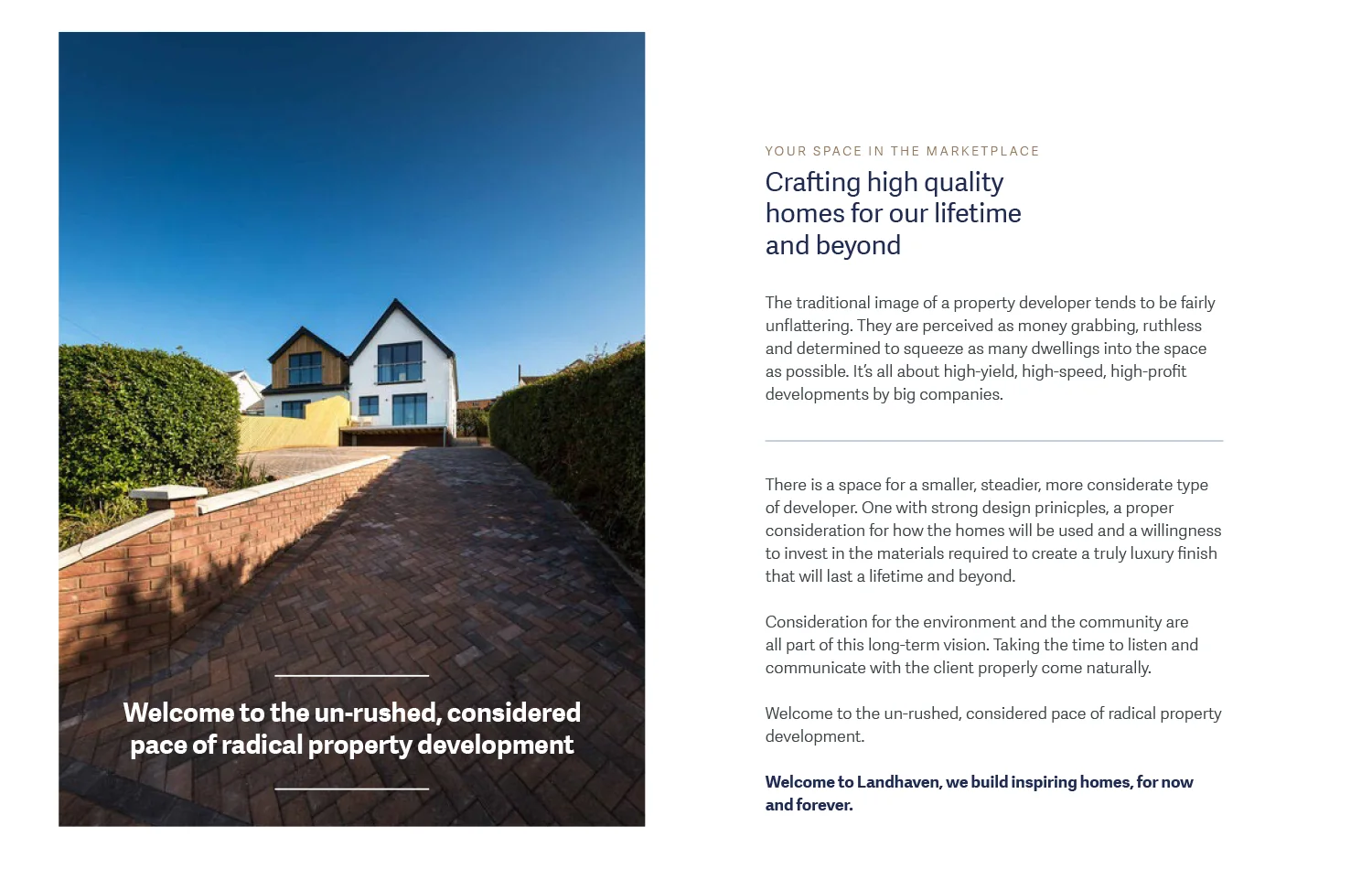
Andrew and I worked through the process together, spent time reflecting and considering how the 2 parts of the business (Landhaven and Co-Haven) should fit together. We dug into the types of clients he attracted and what working with Landhaven meant to them. Building this picture, step-by-step, we could see that Landhaven needed to feel exciting and exceptional but also grounded – the environmental and human impact of development is also key to Andrew’s own process, so the brand needs to show the human side of the business. Because this approach is quite unusual in property development, Landhaven also needed to feel quietly disruptive and radical – a trailblazer in a more considered style of property development.
Love it! The updates to Landhaven are subtle but effective and look great.
Andrew Minto, Landhaven Developments
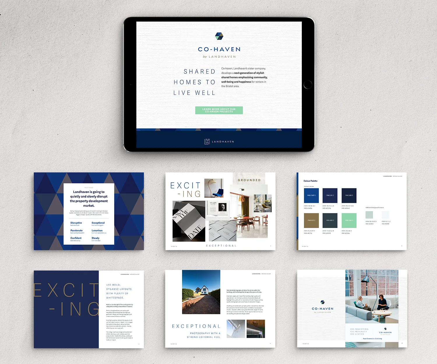
By defining this vision, I could then evaluate the brand itself – logo, type, patterns, photography and tone of voice. The brand was well-designed and in the right space, and by applying the strategic vision, I was able to bring it to life further.
We evolved our brand together before Ellie set us up with materials and a guide pack to inform all our media. She has gone on to help us produce important documents and check that Landhaven media is consistently ‘on brand’. We will continue to work with her.
Andrew Minto, Landhaven Developments
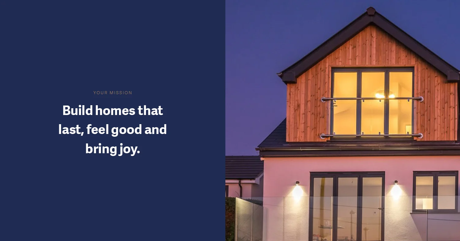
There were minor edits to the logo to give a little more breathing space (and dropped versions no longer needed). The colours were tweaked to push them into slightly cooler tones – bringing a punchier, more dynamic feel. But the biggest shift was how the typefaces and layouts were used. To create a bold, dynamic and exciting feel, I used strong layouts with generous white space and large, striking typography.
Andrew already had some fantastic photographs of his work and these were supplemented with photoshoots with Adele at SuperFunkyPenguin Photography. Adele brought to life the brief fabulously, bringing a strong editorial feel to the property images – full of ‘wow’. The behind-the-scenes images revealed the softer, more human side and balanced the striking layouts with some grounded personal elements.
As part of the creative direction, there were some pointers on tone of voice – needed to reflect Andrew’s care and consideration, this wasn’t where the excitement needed to burst out. This was ready for Hilary Salzman to bring to life the web copy and for copywriter Clare Holman to ensure the blogs were hitting the right notes.
Putting the vision in place injected a new energy into the brand and how Andrew felt about it. There was relief that the process built on the existing strengths and took it to a new level (rather than rebranding), With new energy came confidence and clarity in how the business was no going got be presented, how it communicates and how to market it.
Working with Ellie was amazing. She recognised and articulated qualities in our brand, company, and ethos that we didn’t necessarily realise; and certainly didn’t promote! She helped tease out who we were, what was unique about us, what we were doing, and where we wanted to go.
Andrew Minto, Landhaven Developments
By working through a robust and strategic process, we could focus on how Landhaven needed to be seen in the marketplace. Rather than focusing on singular elements, such as the logo, the overarching picture and experience for the client were foremost in our minds. Once this process was complete – the design of the website became an easy natural extension of this picture. During the process we could always return to the creative vision before making decisions – does this still feel grounded, is it exceptional enough?
The biggest compliment I can give is to say that I love how she thinks. We unreservedly recommend her for all things brand and graphic design!
Andrew Minto, Landhaven Developments
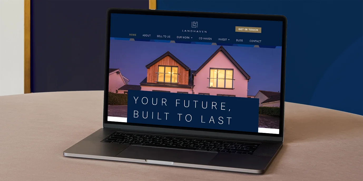
Since completing the brand development process, the new website has been launched (I had the pleasure of designing the pages in conjunction with Anorak Cat). Andrew’s also in the process of getting a marketing plan in place and setting up his mailing list and email newsletters. I’ve been on hand to offer creative direction and design where needed.
Read more about the Website Design process over at Anorak Cat Websites. See the live website: www.landhaven.co.uk
Working as a collaborative team really benefits the client and in November 2023, we were shortlisted for an IPSE Freelancer Project Award. We didn’t win, but we had great fun. Read more about The joy of not winning an award.

Credits
- Brand development by Ellie at Bowie Design
- Brand storytelling and messaging by Hilary at Hilary Salzman
- Copywriting by Clare Holway
- Additional photography Adele at SuperFunkyPenguin Photo + Video
- Website build by Anorak Cat Websites
If this story inspires you, let’s chat and see how I can help you evolve your brand identity.